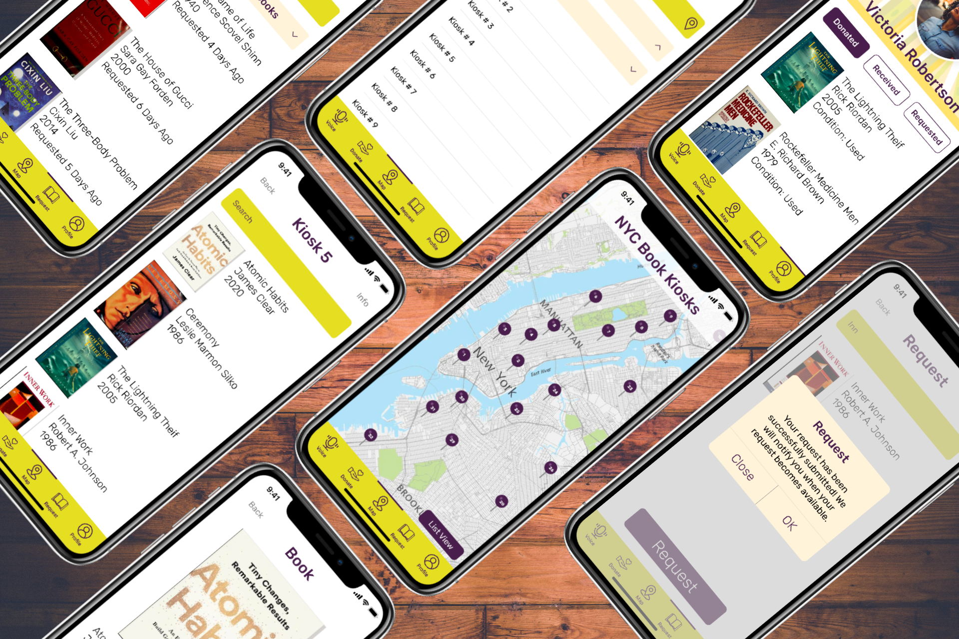
BookShare NYC
An end-to-end Mobile App and Responsive Landing Webpage for Book Sharing in NYC

Role
UX/UI Designer (User Research, Visual Design, Interaction Design, Prototype, Usability Testing, Front-end Development)
Tools
Figma, AdobeXD, VSCode
Team
Self Directed, with consistent feedback from mentor and peers (Course Project/Thesis Project)
Duration
26 Weeks
Project Overview
-
The idea for BookShare NYC surfaced when I was in need of a book for school and had a difficult time affording to purchase the book. During a casual conversation with a coworker, I mentioned the book that I was looking for. It turns out he had the book sitting in his home and decided to give the book to me. He stated that he was going to get rid of the book since he no longer had use for it. At that moment, I realized that I probably was not the only one that was going through a similar situation. I thought to myself that there should be a solution to donate books others might be needing in NYC. While there are places one can go and donate books in NYC, there is no specific place or platform just for donating books.
-
Design an end-to-end mobile app for BookShare NYC that is easy to use with a design complementary to the previously built landing page.
Design the mobile app that directly connects to BookShare NYC book kiosk.
Design a mobile app that allows users to easily donate unused books to BookShare NYC kiosks.
Design a mobile app that includes accessibility for the visually impaired.
Design Process
Project Background
A responsive landing page was built using HTML5/CSS3/SASS/Bootstrap in order to advertise the solution to an original problem that helped me solve how might we help people share/exchange unused books. Through user interviews and ideation methods, one solution that arose was the installation of public kiosks in prime NYC subway stations where people can donate and checkout books and as a result reducing the book waste and in turn helping people feel good about sharing their books with others. I wanted to take these findings further by designing an app that will be linked to the book kiosks and as a result making the use of the public kiosks more accessible for fast moving citizens of NYC.
Findings from my previous project can be viewed here:
BookShare NYC Project Part # 1
Link to responsive landing page:
Empathize
Research
Research enables me to better understand and empathize with my users - not only their immediate frustrations, but also their hopes, abilities, limitations, reasoning, and goals. It lays essential foundations for creating solutions in later stages.
To ensure the research stays on track and better guide the mobile app design later, it is important to create a research plan before diving into the research phase. In my research plan, I have included my research goals, research questions, methodologies, participants, and timeline of my research.
See full research plan here:
Market Research
Once I had a research plan in order, I wanted to learn and understand the latest trends in the book sharing market. I began the empathize phase by conducting secondary research first. It is important to get an understanding of the market in order to get a sense of what we know and don't know yet, who the audience are, as well as what the recent trends or news are. Additionally, I reviewed book sharing applications and companies that offered similar solutions by pinpointing the strengths and weaknesses of each which in turn will help me with any gaps in features that my app might address. The insights gathered from market research and competitive analysis will help me ask meaningful questions in the primary research stage in addition to building assumptions which will later be validated after the interviews.
Here are some findings from the market research:
Competitive Analysis
Next, I conducted a competitive analysis which helps me learn about how the main and indirect competitors of BookShare NYC are catering to customers’ needs, as well as their strengths and weaknesses which in turn will help with any gaps in features that my app might need to address.
See full competitive analysis here:
Here are the main competitors of BookShare NYC:
Assumptions
After all that information was gathered, I created a list of assumptions in hopes that it will help me make sense of the information as well as help me shape important questions to ask in the following stage.
Here are some assumptions:
User Interviews
Building on a general understanding of the market and the audience, I continued to dive deeper and build a real connection with our users in order to gain direct insights about them in the primary research stage.
I created an interview guide to facilitate the user interview process, with open-ended questions which invited the participants to share their experiences and stories.
In total, 5 participants were interviewed about their book sharing experience (if there are any) in the past.
See full interview guide here:
Here are some findings with direct quotes from my user interviews:
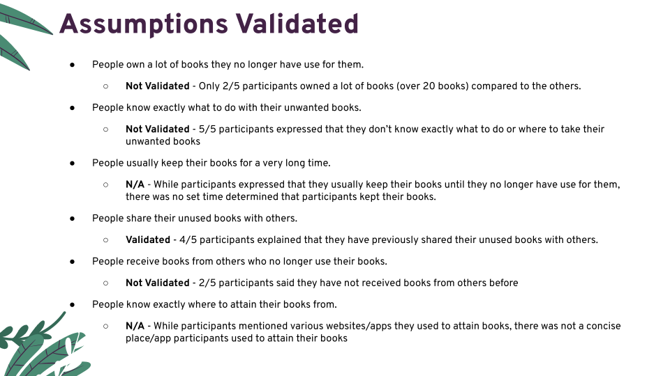
Assumptions Validated
From the information gathered through user interviews, I was able to see whether or not my assumptions were validated.
Here are the assumptions validated:
Survey
I created and conducted a survey to better understand the users needs and to gather insights about the user’s demographics and behaviors when reading books and the likelihood of using a service such as BookShare NYC. I was able to collect results from 29 participants. The target audience were people that read books (no matter the format), commuted consistently in NYC, and are between the age group of 18-44.
The key findings of the surveys were:
Here is a visual representation of my key survey findings:
Accessibility
One of my goals for this project was to have an accessible component. While there are numerous disabilities that one can design for, one accessibility issue I wanted to design for was visual impairments. I wanted to try to accommodate to all potential users of my app/service and by doing so designing a more inclusive experience. By delving into accessible design, I found that not only is it the right thing to do but often times accessibility features that help people with disabilities often help other people too. For instance, a voice assistance feature not only helps people with visual impairments but also helps the average person who may not be able to type something out in the given moment. Moreover, no matter the user’s abilities it important to take in account that a user might face a challenge due to a given context at some point in their user experience. For those reasons, I created a user persona who is visually impaired in order to help guide me in understanding and ultimately building an accessible end design.
User Persona
Based on the feedback and insights gained from research, I created two personas who might use the BookShare NYC application. These personas demonstrate the key users goals and frustrations that appeared in my findings. This will help me focus on tackling the most important problems in order to address the major needs of the most important user goals. It is both fictional and realistic.
Here are my user personas:
Empathy Map
Once the personas were created, I developed an empathy map for both Katie and Mike. This allowed me to further understand my personas’ pains and gains, as well as seeing their state of mind when it comes to sharing unused books as well as attaining free books. I wanted to showcase how the topic of sharing and attaining unused books affected their everyday actions and thought processes.
Here are my empathy maps:
Define
Defining the Problem
Now that I have a good idea of who my users are and what their wants, needs, and pain-points are, I am ready to turn my empathy findings into an actionable problem statement. By doing so, it ensures that I have fully understood the goal of the design project and in turn steering me in the right direction towards a proper solution.
Moreover, the 5 whys technique allows me to delve deep into the problem and allow me to identify the root cause which then I can act upon.
Here are the 5 whys:
Hypothesis
I then came up with a hypothesis statement:
Molecule
Creating a molecule helps me quickly identify a person, with a problem and a proposed solution. This helps me create alignment and focus on who I am targeting, what problem I think they have and gives me the opportunity for a possible solution.
Here is the molecule:
Success Metrics
Success metrics are a set of quantitative statistics points utilized to measure, compare, and track the user experience of an app over a period of time. They are important to determine so that UX decisions are made based on evidence and not solely on facts.
Here are a list of success metrics:
Ideate
During the ideation phase, it is important to generate as many ideas as possible. It is better to focus on quantity rather than quality of ideas so that I can have many angles of thinking towards shaping the solution for my design. Some of the ideas generated have the potential to go on and be part of the solution of my design in the end.
Here are some ideation methods:
Crazy 8s
Crazy 8s is a fast sketching ideation method that challenges people to sketch eight possible ideas in eight minutes. The goal is to build beyond your first idea in order to come up with a variety of solutions to your problem.
Here is my crazy 8s ideation method:
Crazy 8s
A mobile screen where a user can look through all available books; users can also search for a particular book. The button is to select multiple books at once.
A mobile screen where based on the user’s location, it shows what books are available nearby.
A mobile screen showing a user’s profile and all the books they have donated.
A mobile screen showing a map of NYC and all the locations of all kiosks.
A mobile screen showing all the books that have been recently added to kiosks and a button to choose one or more.
A mobile screen that shows a particular kiosk and all the books available at that kiosk.
A mobile screen showing more information about a particular book; shows where is it available and in what condition.
A mobile screen where a user can request a book they need; later will get a notification if it becomes available.
** All screen have bottom navigation.
Worst Possible Idea
Worst idea possible is an ideation method where the designer purposefully seeks the worst solutions to the original problem. The goal is to examine bad ideas which can lead to insights towards great new ideas.
Here is my worst possible idea ideation method:
Worst Possible Idea
Paying to get to a kiosk.
A kiosk that doesn’t give you the book right away but rather it ships it to you.
Have a security guard at every kiosk.
App. calls someone in a call center who then sees if books is available.
Go to every possible kiosk in NYC to find one specific book.
Ship the books to someone who then puts them into a kiosk.
Only have kiosks in schools across NYC.
App. doesn’t tell you where the kiosk are located.
App. doesn’t tell you what books kiosks have available.
Kiosks give you a book at random.
Mind Mapping
Mind mapping is an ideation technique that helps us collect information based on one central topic in a systematic way. The goal is to focus on big ideas without the small details all while connecting one idea from a previous one and so on.
Here is my mind mapping ideation method:
Affinity Mapping
Affinity mapping is an ideation method that helps designers gather qualitative information or ideas about your users/product and then group them into categories. This allows us to understand and further break down significant amount of information and ideas previously collected.
Here is my affinity mapping ideation method:
User Journey
A user journey map helps me visualize an individual’s relationship with a product or problem over time while taking in account the feelings that are evoked. It allows me to understand the product from a user’s point of view which in turn fosters a more user centric approach to designing the end product.
Here is my user journey ideation method:
Task Flows
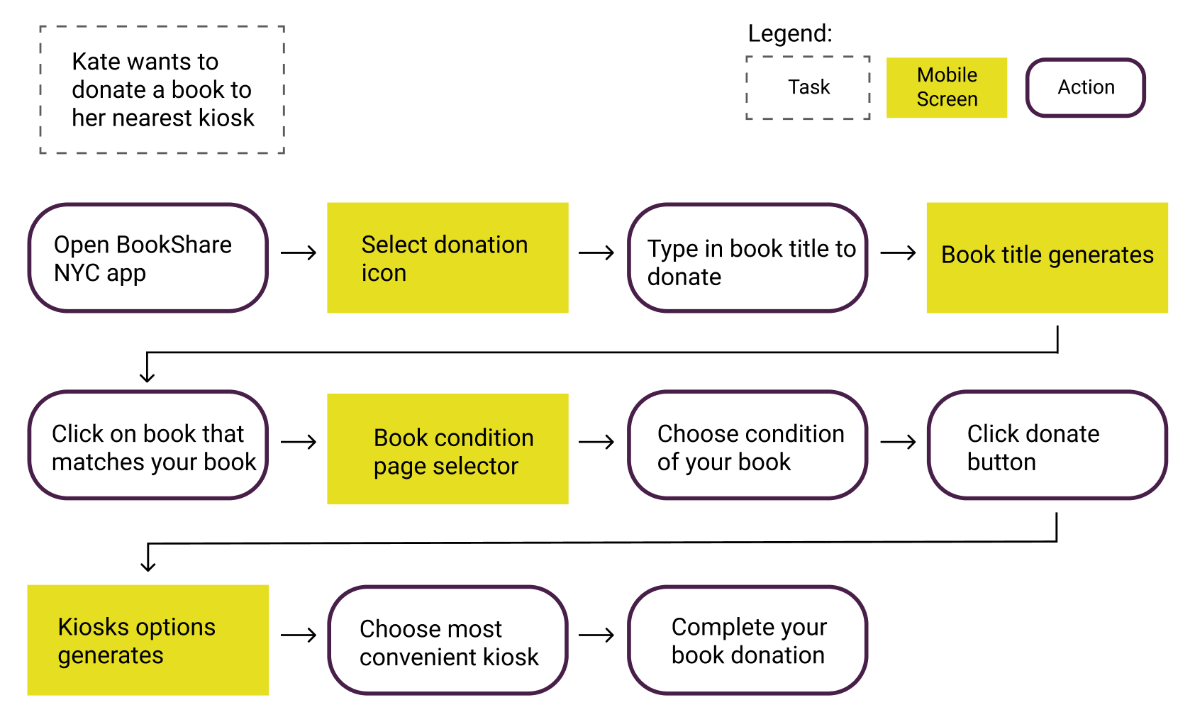
In order to better assist the users in navigating through the application and to identify the main flow of users when they are completing a task, I created 3 task flows centering on the key features of BookShare NYC. By doing so, I was able to decide what I am designing as well as determine the necessary steps and examine the user experience in details.
Below are the 3 task flows I have created:
Wireframes
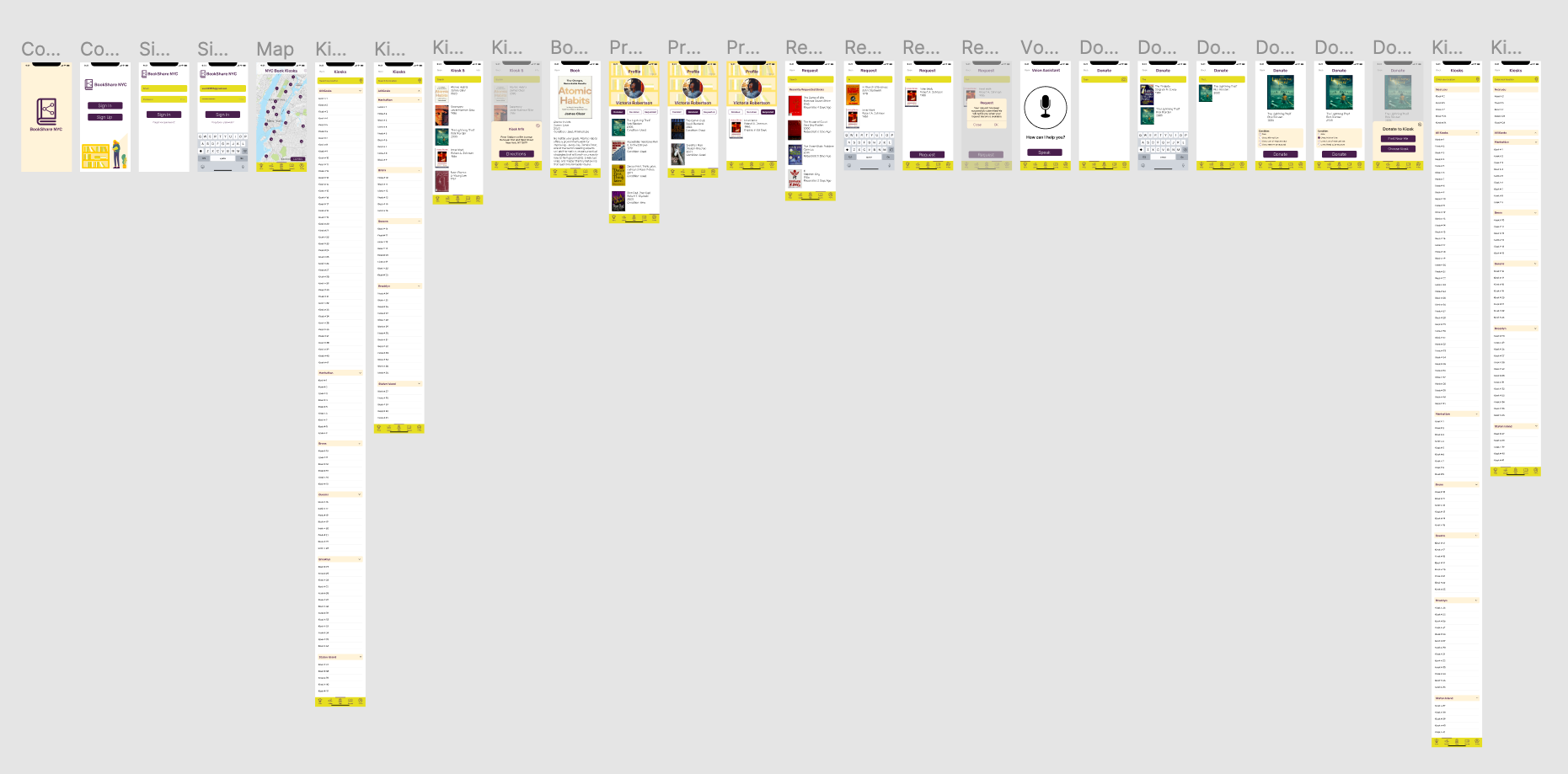
I created the low fidelity wireframes which helped me focus on the visual consistency and hierarchy before applying styles. Creating low fidelity wireframes helped me visualize my ideas as well as give me the basic structure for how users would use the app for donating unused books as well as requesting books from the public kiosks. I tried to incorporate common design patterns and elements that directly address users' goals, needs, frustrations, and motivations all while keeping in mind the findings from my user personas, empathy map and research. In addition, since I am designing an app for iOS system, I referred to Apple Human Interface Guidelines in the design process.
Here is a screenshot of the low-fidelity wireframes:
Wireframe Usability Testing
I went ahead and conducted usability testings with 5 participants which as a result will be useful for detecting issues in information architecture and flows before implementing further design details and styles.
Here is a list of testing tasks I gave my participants:
Login
Find a kiosk on the map
Get more information about this kiosk
Look at what is available in that kiosk
Click on book 1
Go back
Find where to go to your profile
Find where to request a book
Find where you would type a book title
Request a book
Find where to activate the voice assistant
Find where to donate a book
Find where to type a book title
Choose the condition of “used; minimal use”
Donate the book
Choose where to drop off your book
Find where to go back to the map
After the usability testing was done, a few iterations needed to be done in order to move forward with the design.
Here is a screenshot of the revised low-fidelity wireframes:
Here are some iterations that were done:
Wireframe Usability Testing Evaluations
When asked to log in; user clicked on the text input field
Fix: Find how to prototype a typing simulation on Figma
When asked to find a kiosk on the map, the dot used was not very straight forward
Fix: Use a better representation of kiosks on the map; also have a list view
When asked to get more info on kiosk, that part was not clickable
Fix: Prototype that part and show more info on kiosk such as location, etc.
When asked to choose the book condition; user would click on the words rather than the radio button
Fix: Prototype a larger clickable area
All in all, the idea of the app was very clear and straightforward.
Users liked the tracking of books donated/received.
One user asked about the voice assistance and accessibility of the app was explained.
No users had difficulty understanding the representation of icons.
Now that we have collected all the information from the ideation phase, we move on to the prototype and testing phase.
Prototype & Test
Accessibility in UI Design
Since my project has intentionally been designed to have an accessible portion, it was important to go beyond certain features and make the UI design itself accessible. My color palette was carefully picked to pass all levels of WCAG (Web Content Accessibility Guidelines) compliance. Upon checking the color contrast of my color palette, I found that it passes the highest level of WCAG AAA which makes my app optimal and accessible to the maximum number of users and as a result makes it an easy experience for any one.
Below I have included contrast checker results for all the color components that appear in app:
UI Design
This is my UI style guide which is also the same UI style guide used for the design of my landing page.
Here is my UI Style Guide:
Initial Prototype
Once I collected feedback from the wireframe testings and had a UI style guide in place, I created the high fidelity prototype with all the styles applied.
Here is a screenshot of the initial prototype:
Prototype Usability Testing
After I finished designing high fidelity screens, I conducted usability testings with 5 participants which as a result will be useful for detecting issues in flows before designing the final prototype. I approached the prototype testings by using the Microsoft RITE Testing Method. The RITE method is short for Rapid Iterative Testing and Evaluation and it consists of making necessary changes to prototype as soon as a problem is identifies and a solution is clear before the next testing. The testings then get reiterated based on the previous findings. The idea of this testing method is to solve a problem as soon as it arises. In this case, since there will be 5 participants, I expect to have 5 reiterations of the prototype which will influence the final prototype.
Here is a list of testing tasks I gave my participants:
Sign In
Find where to click on the list view (and collapse the all kiosk list)
Go back to the map
Find Kiosk #5 on the map.
Get more info about this kiosk (which one do you expect to happen)
Click on the first book on the list. (what other info do you expect to find here)
Go back
Find where to go to the profile page
Look through the donated/received books
Find where to request a book
Click on the type input field
Request the book (what do you expect to happen after pressing request button)
Find the voice assistance
Find where to donate a book
Click on the type input field
Select the condition of the book (used; minimal use)
Donate the book
Donate to kiosk near you
Go back to the map
After the usability testings was done, a few iterations needed to be done in order to move forward with the final design.
Here are the results from RITE Testing # 1:
Here are some iterations that were done:
Here are the results from RITE Testing # 2:
Here are some iterations that were done:
Here are the results from RITE Testing # 3:
Here are some iterations that were done:
Here are the results from RITE Testing # 4:
Here are some iterations that were done:
Here are the results from RITE Testing # 5:
Here are some iterations that were done:
Final Prototype
Now that I have addressed all of the issues that resulted from the usability testing, I moved on to designing the final prototype of my app. I prototyped my app in two different interface design tools, Figma and adobe XD. I used Figma for my main design and adobe XD for the voice assistance portion since adobe XD offers the capability of voice assistance prototyping.
Here is the final prototype:
Project Takeaways
Final Thoughts
With the prototype created, I believe I have met the goals that were outlines in the beginning of the design process. I designed a mobile app for BookShare NYC that connects to public book kiosks and centers around donating unused books. I also designed an accessible portion which makes my app experience available to all users.
Next Steps
Accessibility: I would dive deeper into the accessibility design portion of the app. I would like to learn more about screen readers and other possible design features for the visually impaired.
Kiosk Interface Design: I would continue to do research on how to implement design features and functionalities to the physical kiosks.
Usability Testings: I would love to do more usability testing to further expand on my design and see if any additional features need to be added.
Maintenance: Updates and revisions will continue to exist in the future, and I will address them based in priority levels.
Design Implementation: The next step would be the development phase in which I would effectively communicate with developers on how to implement my design.


